A very useful approach to analyzing price action of a particular security is to search historical instances where price exhibited similar behaviour. This type of analysis has often been called historical analogs by some writers. Below we will show a simple example that is easy to implement in excel. The aim is to select a security and a time period. In our case we will look at USDKRW spot rate over the last 3 months. What we wish to do is to find historical 3 month (non overlapping) periods where USDKRW price pattern was similar to its recent behaviour.
We first need to load in historical data into excel in ascending order. Below we loaded in 15years worth of data and are interested to find historical time slices that most closely match the price behaviour from 24Apr2015-24Jul2015.

Next we need to decide on what exactly we mean by “similar” price action. What we actually need is a measure of similarity. In data mining there is a wide array of distance measures used including Euclidean Distance, Dynamic Time Warping, Pearson Correlation Distance and others. Each approach has its strength and weakness. For our purposes we chose the Pearson Correlation Distance measure for its simplicity. This distance measure it equals to 1-Correl(OurTargertSample,PottentialSimilarSample). Where OurTargertSample is the daily time series from 24Apr2015-24Jul2015 and PottentialSimilarSample is every 91 calendar day time series from the 15 year time series we are analyzing. We subtract the correlation from 1 because this is a distance measure. Therefore we are looking for a distance measure as close to 0 as possible. Also, in our implementation we calculate the correlation on log price series. This is a choice from our experience of running this type of analysis over many asset classes and variety of look back periods with results looking a bit better when using log price data. We should point out that this is a modelling choice and there is no theoretical justification for the choice made.
We can look through our 15 years of data and calculate a distance measure for each sample and write the output to a selected range. For example below LogPriceData is a two dimensional array with first column holding dates and second column holding log(price). We then write the sample start and end period along with distance measure to a separate sheet.

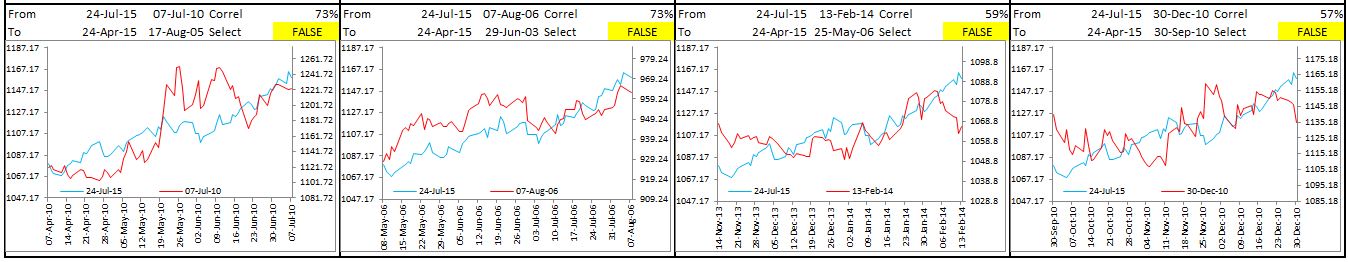
After calculating all the distance measures we can sort the data by distance measure from lowest values to highest and check for overlapping samples. As we work our way from top to bottom we can check to make sure that current sample data range is not overlapping with the previous sample range. If it is we can ignore it because the preceding sample is in the same date range but has a lower distance measure. We then filter for the top 20 time periods which have the lowest distance measures in the past 15 years and which are non overlapping. The results are below.

Now that we have our top 20 matches it is crucial that an analyst compare the results visually. Because excel has done most of the work the number of potential cluster members has been reduced to a manageable number. We can select only those which we deem to be close enough after visual inspection. Its important to mention that at this point we are not looking at any data outside of the matched sample so that we don’t bias our analysis. We will consider USDKRW performance outside of the sample windows only after selecting those that we deem to be close matches.
We have selected four cases as being close after visual inspection. The selection is marked TRUE above each chart if we wish to analyze the data for that sample in the stage that follows. At this point analysts may differ on what we deem to be a close match. However we believe the flexibility of controlling the cluster of similar time series based on visual inspection is important.
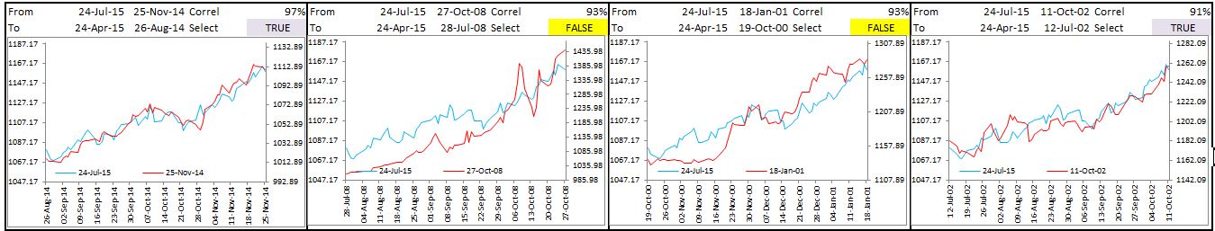


We have selected 4 samples in our cluster, 26Aug2015-25Nov2014, 12Jul2002-11Oct2002, 6Mar2012-5Jun2012 and 9Jan2013-10Apr2013.
After we have our clusters we can look at what USDKRW spot dynamics were outside of the sample period. In our case we look at USDKRW spot returns 21 days after the last observation of the sampled period. In each instance of the 4 examples USDKRW traded lower. The average and median cumulative returns are plotted below. We also present 90% confidence bands to check for statistical significance. In a future post we will explain these calculations when looking at event analysis in excel.

It is important to mention that this is just one tool to help with analysis of potential trade ideas and should definitely not be used on its own. In case of USDKRW now there are a variety of issues pressuring the pair higher.
There have been significant outflows out of equities and bonds by foreign holders.

Asian equities have been on the weak side

It is however peculiar that Korea was the worst performer in Asia FX. In fact it has been underperformed by only a few commodity currencies like AUD, CAD, and BRL globally.

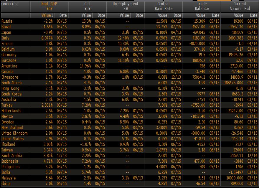
While portfolio picture hasn’t looked pretty recently it’s important to remember that Korea has a strong C/A position. Comparison between G20 and other select Asian countries reveals that Korea is in the middle of the pack in terms of GDP and Inflation and CB policy rate. Unemployment rate is low and as already mentioned C/A position should be a tailwind for KRW.
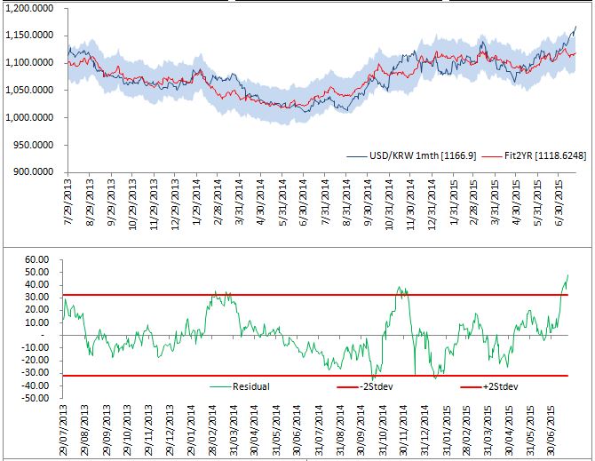
Also, NDF is looking rich based on a model which conditions FX rate on interest rate differentials, global equities and commodities (all factors which have been moving against KRW recently)
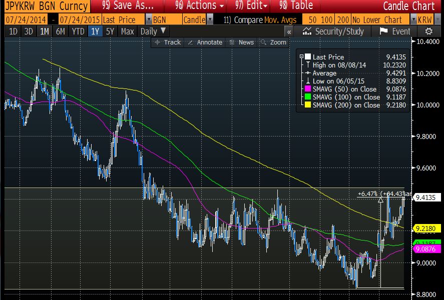
All-in a short position in USDKRW seems like an asymmetric bet with good risk/reward. The risk to the trade is a broad USD rally or Chinese equity draw down. JPY weakness is also risk to the trade however recent JPYKRW strength reveals KRW under-performance with the cross trading at the top of its recent range. JPYKRW cross appreciation of 6.5% from the lows should remove the impetus to official jawboning of KRW.

how did you calculate the “Fit2Yr” red line plot? is it rolling average next day expected return of the top 20 closes matches?
from the analysis before that you seem to have hand selected 4 instances and calculate the forward expected return. i am confused if they are based on the same analysis.
Thanks
LikeLike